Principles of Design
- Oct 1, 2018
- 2 min read
CONTRAST:
"The state of being strikingly different from something else in juxtaposition or close association."
Contrast can be used in a variety of forms - from colors to concept. Using contrast in graphic design can be a really simple yet effective way to make a statement in my opinion. The contrast between colors can make a piece of design visually bold and eye-catching. In a similar way, the juxtaposition between concepts that contradict each other can make an outstanding statement.


Emir Shiro is a graphic artist i found on Instagram. I follow and love his work because of the contrast between the pictures he puts together to create one image. Above are 3 examples taken from his Instagram that in my opinion are good examples of contrast. I think that they're good examples because I think they're unusual concepts that work really well together.
WHITE SPACE:
"Negative space helps to define the boundaries of positive space and brings balance to a composition."
White space is always part of an image in, whether it's being used as part of the design or not. The use of white space in graphics or art can be very subtle and subliminal which I think is sometimes part of what makes it effective - or it can be really obvious and striking which can be a more memorable technique.
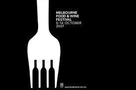


These are 3 images using white space I found on google that I personally really like.
I think that because of the minimalism of just the two colours makes the white space stand out a lot more which then helps communicate the point of the posters a lot faster.
I think that when white space is used in design it can be a bit of an 'Easter egg' which is subliminal and interesting to find in the image, but I think because some of these posters are being used as advertisements it's important that the viewer understands the purpose of the advertisement quickly to ensure they don't lose interest.
REPITITION:
"the reusing of the same or similar elements throughout your design."
I've most often seen repetition used as part of pattern design - however I think the use of it within an advertisement or marketing piece can be a powerful technique when it comes to creating an indelible impression.


These are three posters I discovered when researching repetition. They caught my eye as again they're simple and self explanatory. I like this because I think in this day and age less is more - especially as technology is advancing faster, it's important for design to capture visual engagement while communicating almost instantaneously.
PROXIMITY:
"nearness in space, time, or relationship."
Proximity in design in placing related items closer together to produce a clearer and neater design. Proximity helps to portray a message quicker, which can be important to keep visual engagement.
Balance
Alignment


Comments